Exploratory Data Analysis (EDA)#
Show summary statistics for your data (e.g., mean, min, median, max, percentiles, etc.) to understand the overall distribution.
Plot distributions for each column and list the unique categories in categorical columns.
This helps you spot missing or unusual data early, so you can quickly decide if you need to switch datasets or merge with other datasets to fill in missing information.
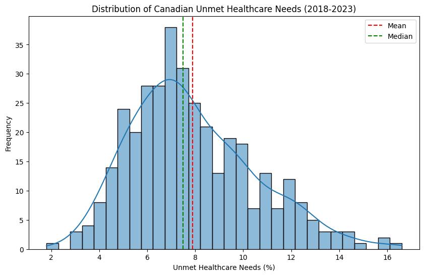 Distribution of Canadian unmet healthcare needs (2018–2023)
Here’s an example of what a distribution plot can show us. This histogram displays how unmet healthcare needs are spread across the dataset. Visualizing the data like this helps reveal important characteristics—such as skewness, central tendency, anomalies (values that are significantly different from the overall pattern), and overall spread—that aren’t always obvious from summary statistics alone. In this example, the red (mean or average) and green (median or middle value) lines help us see whether the data is balanced or skewed to one side. Charts like this are super helpful early on—they give us a quick sense of the data and can highlight anything unusual that might be worth exploring further.